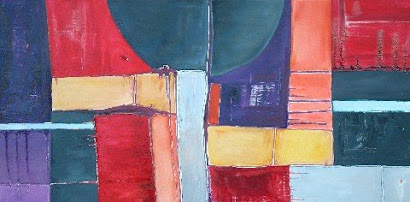
 Another one of my latest in the Alzheimer's series. I used some earthy tones in this piece, like the browns and yellows but I think with the bold blue/greens the painting still has a vibrant quality. Perhaps it's the contrast between the muted colors and the bold colors that make the bold colors appear even more brilliant. I am always very careful in my color selection when I paint-each area of the piece has it's own personality but, at the same time, has to compliment or contrast the next. Sometimes I change a color 10 times before it is just right. For me, the title "Clarity" suits this painting not only in the meaning behind it but also in the feeling you get from it. What is the feeling you get from this piece?
"Clarity" is currently on exhibit at the Goggelworks in Reading, PA. If you are in the area, please check it out in person.


